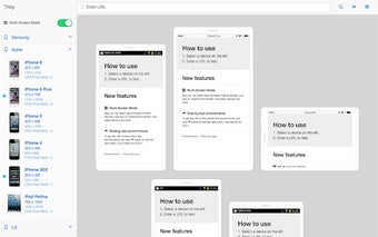
Test Responsive Websites with Troy
Troy is a free Chrome add-on designed to assist developers and designers in testing the responsiveness of websites across various device screen sizes. With over 30 different testing environments available, including popular brands like Samsung, Apple, and Google, users can easily simulate how their websites will appear on different devices. This tool is particularly beneficial for ensuring that web pages are optimized for mobile devices, enhancing user experience and accessibility.
While Troy provides a helpful framework for testing, it is important to note that some websites with X-FRAME-OPTIONS may not be displayed correctly within the tool. Additionally, the rendering results may not fully replicate the experience on actual devices, as there are limitations regarding User-Agent header modifications. Overall, Troy serves as a practical resource for developers looking to improve their website's responsiveness.